This tutorial shows you how to set TextHeightBehavior of a text in Flutter.
Flutter allows us to set the line height of a text by defining a TextStyle with a specified height property. However, in some cases, it's necessary to have a custom behavior how the height should be applied on text. For example, if you need to set whether the height is applied to the first or last ascent, or how to distribute the text leading. For that purpose, you can define a TextHeightBehavior value to the widget that displays the text. Below are the usage examples.
For example, we have the following Text widget.
  Text(
    'Woolha\ndot\ncom',
    maxLines: 3,
    textAlign: TextAlign.center,
    style: TextStyle(
      fontSize: 24.0,
      height: 3,
      backgroundColor: Colors.teal,
      color: Colors.white,
    ),
  )
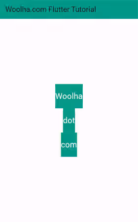
Below is the output if we don't set the TextHeightBehavior.
Output:

Set TextHeightBehavior
To set the text height behavior of a text in Flutter, you have to create a TextHeightBehavior object and pass it to a widget that supports this type of parameter, which includes Text and RichText. The constructor can be seen below. It has some named arguments and all of them are optional since Flutter already defines the default values.
  TextHeightBehavior({
    bool applyHeightToFirstAscent = true,
    bool applyHeightToLastDescent = true,
    TextLeadingDistribution leadingDistribution = TextLeadingDistribution.proportional,
  })
Example:
  Text(
    'Woolha\ndot\ncom',
    textHeightBehavior: const TextHeightBehavior(),
    style: TextStyle(
      fontSize: 24.0,
      height: 3,
      backgroundColor: Colors.teal,
      color: Colors.white,
    ),
    // other arguments
  )
Since we don't customize the default behavior (using the default values), the output should be the same as the one without TextHeightBehavior.
Set Apply Height to The First Ascent
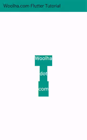
A text can have multiple lines. By default, the value of TextStyle.height is applied to all lines. If you want to prevent the height from being applied to the first ascent, you can set the value of applyHeightToFirstAscent to false. When false, Flutter will use the font's default ascent. This property only has effect if the text has a non-null TextStyle.height.
  Text(
    'Woolha\ndot\ncom',
    textHeightBehavior: const TextHeightBehavior(
      applyHeightToFirstAscent: false,
    ),
    style: TextStyle(
      fontSize: 24.0,
      height: 3,
      backgroundColor: Colors.teal,
      color: Colors.white,
    ),
    // other arguments
  )
Output:

Set Apply Height to The Last Ascent
To set whether the height should be applied to the last ascent, you can set the value of applyHeightToLastAscent. It only has effect if the text has a non-null TextStyle.height.
  Text(
    'Woolha\ndot\ncom',
    height: 3,
    textHeightBehavior: const TextHeightBehavior(
      applyHeightToLastDescent: false,
    ),
    style: TextStyle(
      fontSize: 24.0,
      height: 3,
      backgroundColor: Colors.teal,
      color: Colors.white,
    ),
    // other arguments
  )
Output:

Set Leading Distribution
Another thing that can be adjusted is how to distribute the text leading. You can set it by passing a TextLeadingDistribution enum value as the leadingDistribution argument. The available values are proportional (default) and even. It only has effect if the text has a non-null TextStyle.height.
  Text(
    'Woolha\ndot\ncom',
    height: 3,
    textHeightBehavior: const TextHeightBehavior(
      leadingDistribution: TextLeadingDistribution.even,
    ),
    style: TextStyle(
      fontSize: 24.0,
      height: 3,
      backgroundColor: Colors.teal,
      color: Colors.white,
    ),
    // other arguments
  )
Summary
To control how the specified text height should be applied to a text, you can pass a TextHeightBehavior value to the widget that displays the text. It allows you to specify whether the text height should be applied to the first and last accent as well as how the text leading is distributed.
